I am a Gmail user, but I came across a situation in which I needed to make a switch and use Hotmail. After working a week extensively with Outlook.com I could not believe how a big company like Microsoft creates such a difficult user experience system. I worked with UX for a few years and within a few minutes of using Hotmail, I had a long list of usability issues that could be fixed within one business day by an average webmaster.
Overall I am fine with all of this metro style, because I like simplicity and the correct alignment of elements. However, the most bothersome issue is when a tool I use a majority of my workday is the biggest problem. I focus on the visual aspect of the issues, but the functionality problems are a nice topic for a separate post.
The Art of Deleting Emails

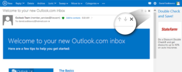
How can keeping a “delete” button next to the navigational arrows be a good idea? All three of the icons are 17 by 16 px small and close to each other. If you go through your emails one by one, you are going to have a bad time. While going through my emails with a regular rate of speed, I accidently deleted the wrong emails multiple times.
When you look at the design of Gmail it is noticeable how the “delete” button is far away from any other navigation. This is what an email navigation bar should look like. The “delete” function should be kept away from any other navigation keys.
Now, look at the top navbar for Hotmail you can see another “delete” button located just next to the “replay” button. On top of that there is a drop down menu that is just a pixel away, which you need to target precisely with your cursor otherwise you might end up hitting “delete” – which most users do.

Problems with the “delete” icon exist whenever you see a list of emails. The screenshot below demonstrates the placement of the “delete” and “unread” icons right next to each other. Both icons are very small and so close together. Wouldn’t moving the “delete” button to the far right be a better idea?

Power of Visual Communication
The top navigation bar in Hotmail is a classic example of what to show visual design students what not to do in the designing of intuitive navigation. My observation is chunky words next to each other and to read each link before clicking involves much more thought than necessary.
There is a “beautiful” plus sign next to “new”, but why not put any icons next to the other links? Below is a quick markup of the same navbar with some spacing between links and added icons. This simple change took me 3 mins to do in Photoshop (approximately 30 mins to implement) and would increase the high usability of this menu.

Hiding Useful – Showing Useless
90% of my workflow (I observed similar behavior in my colleagues process) with emails involves creating new emails, replaying, forwarding, and deleting. I do not sweep and move my emails or try to categorize my type of junk emails. There are many useless links I do not use and many links that do not belong in the drop down menu as well.
Another suggestion would be to have the drop down menu on hover, because clicking on an arrow next to “junk” shows a menu. Clicking on the word “junk” marks your email as “junk”, which could be argued the correct way, but it’s actually really confusing. Your cursor clicks must be very precise when clicking on the desired spot.

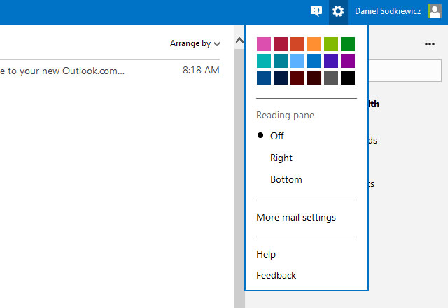
The change of color on my interface and the layout settings are not something that is changed on a regular basis. There isn’t any need for it to be handy, so the “settings” icon is unnecessary. Plus, there is a very obvious typo “Reading pane” seen by millions of users. I think they meant “Reading panel”. EDIT: It looks like it supposed to be like that “Reading pane,” which makes me ask: why using not intuitive names? I am a new hotmail user, how can I know what does this mean?

Etc.
Hotmail has a great deal of work ahead of them, because this was only part of my findings. Thus far – Gmail is far from having any type of competition.

You must belogged in to post a comment.